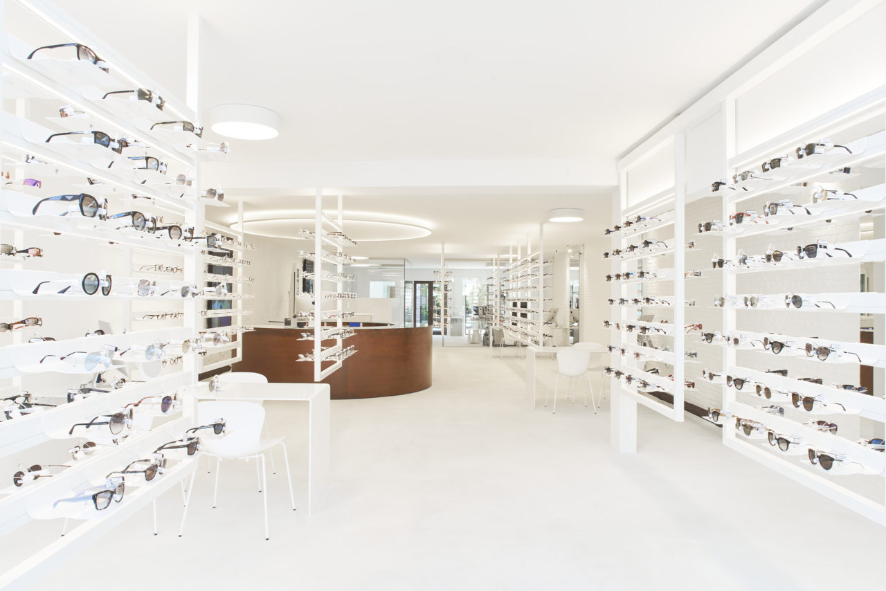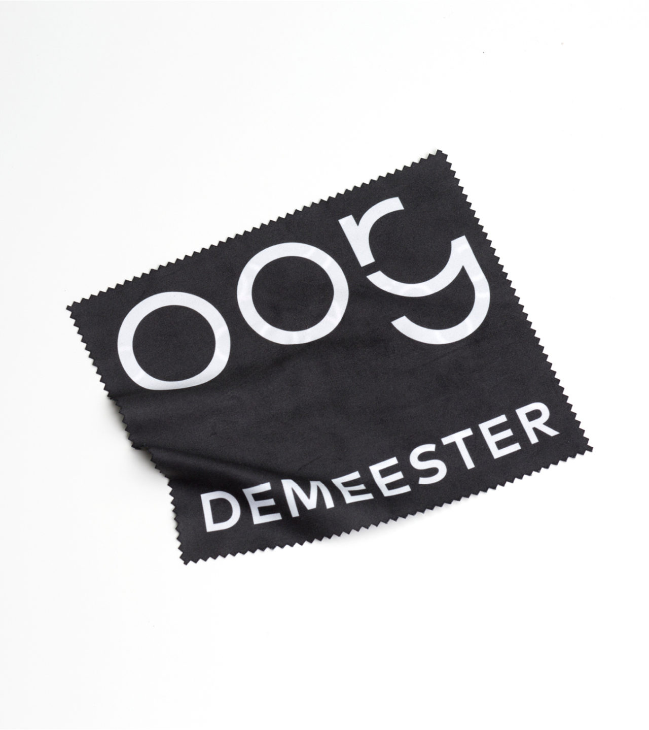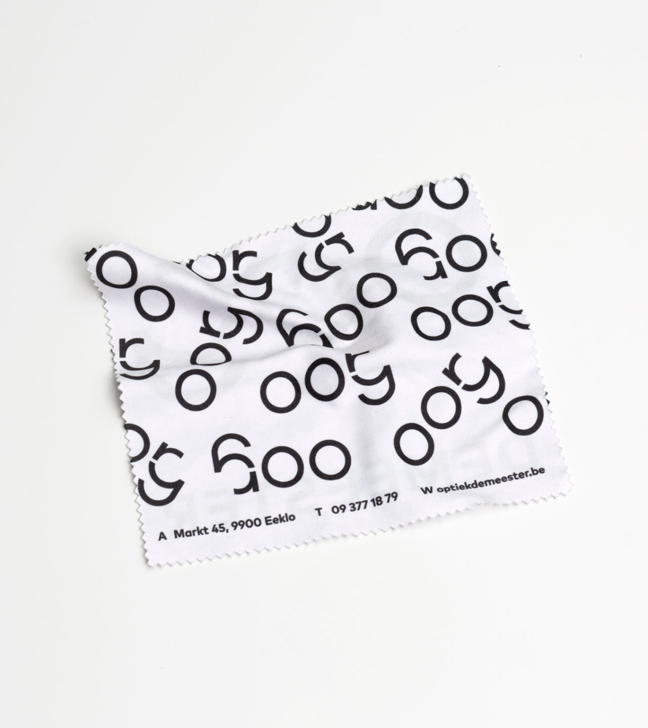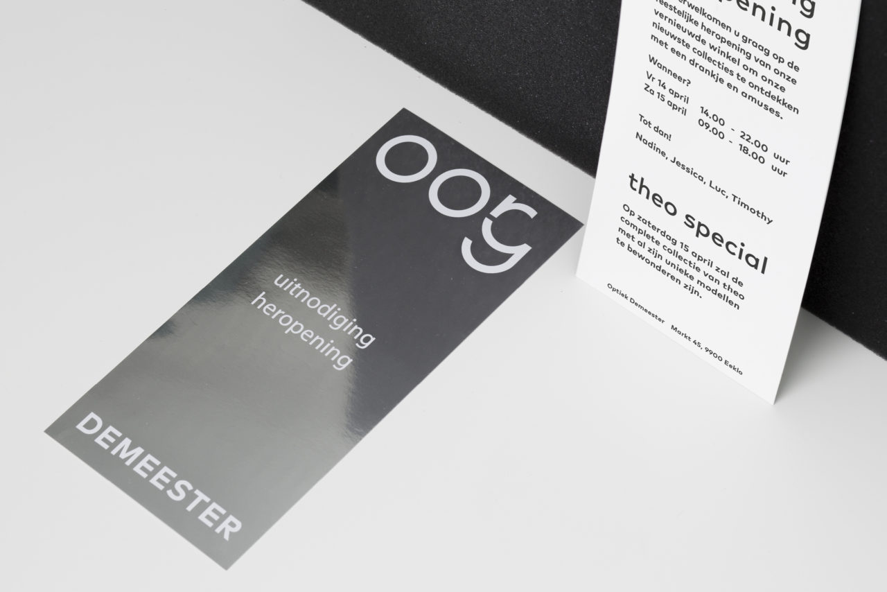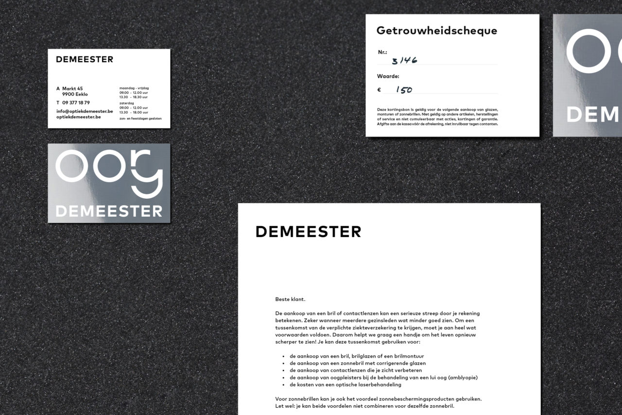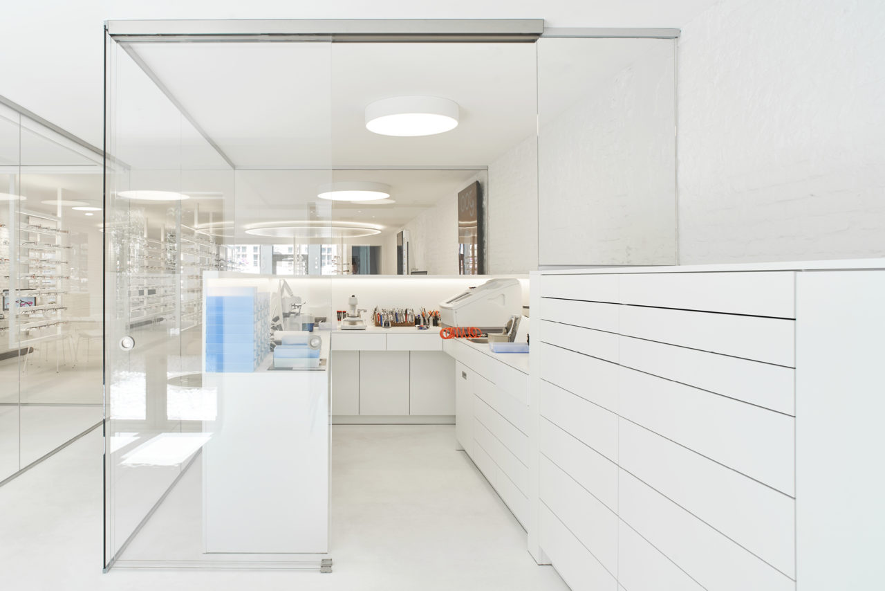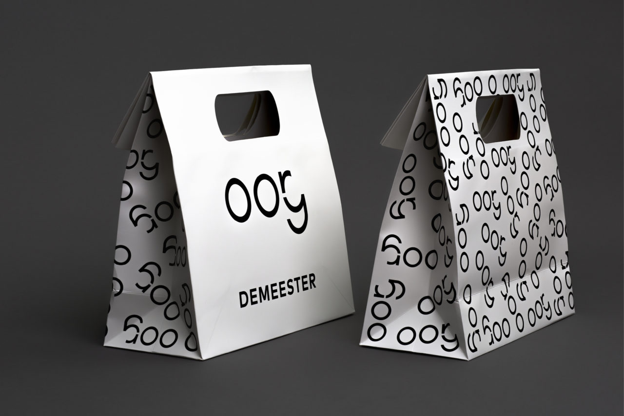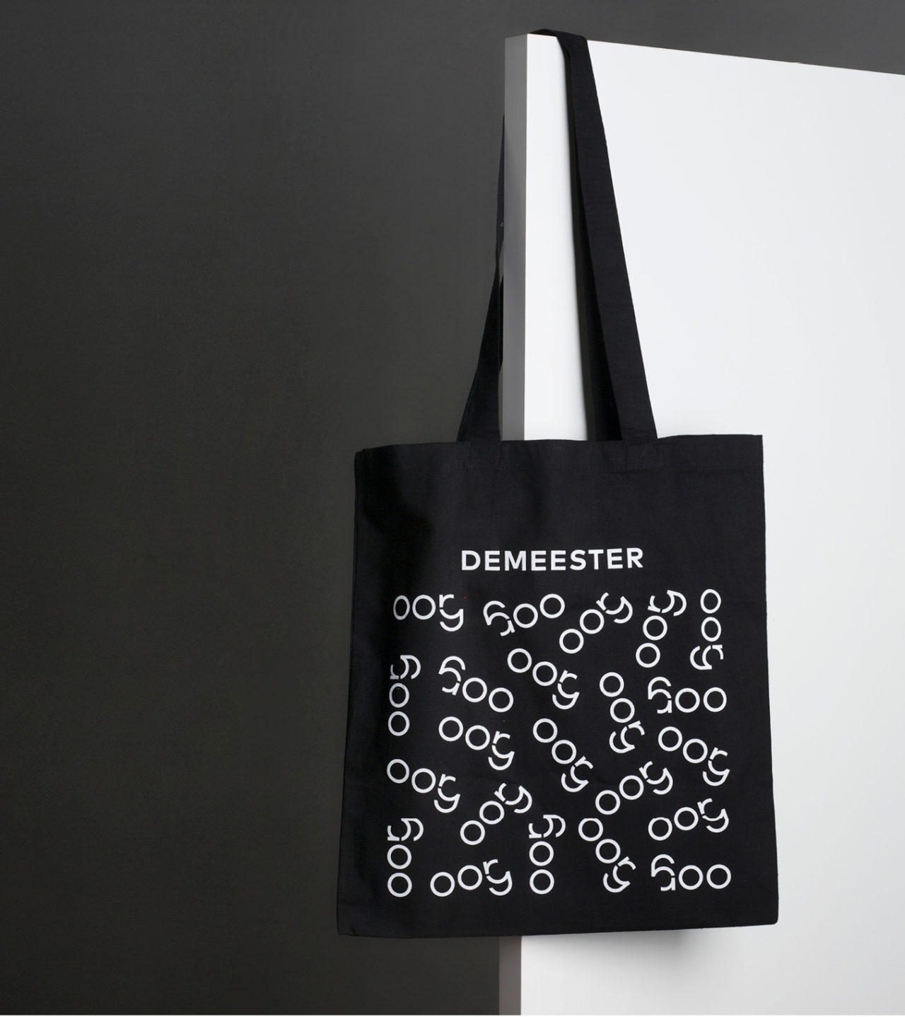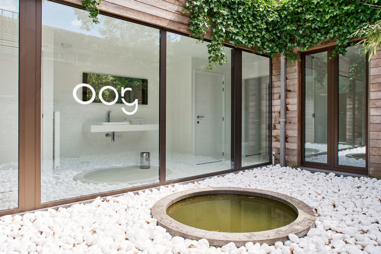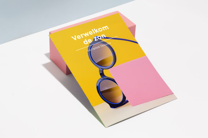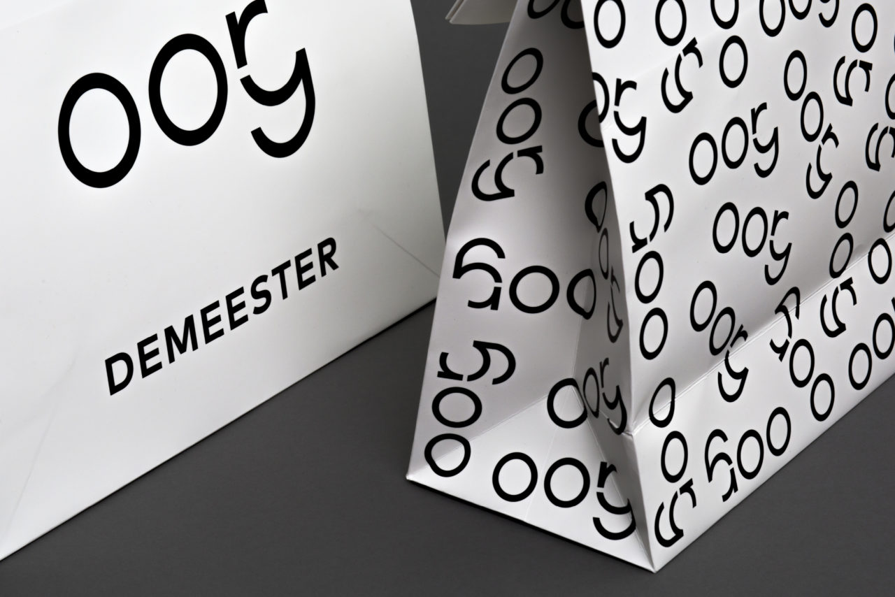
Optiek Demeester is a family-owned business with countless years of experience in glasses and hearing aids. They are specialised in anything to do with the eye and the ear. With these two words (‘oog’ and ‘oor’ in Dutch) in mind, we designed a contemporary for the newly renovated, modern store with a classy legacy.
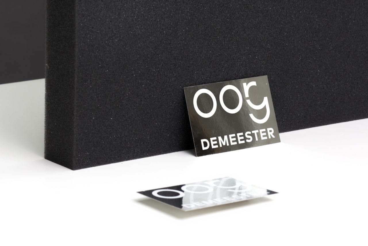
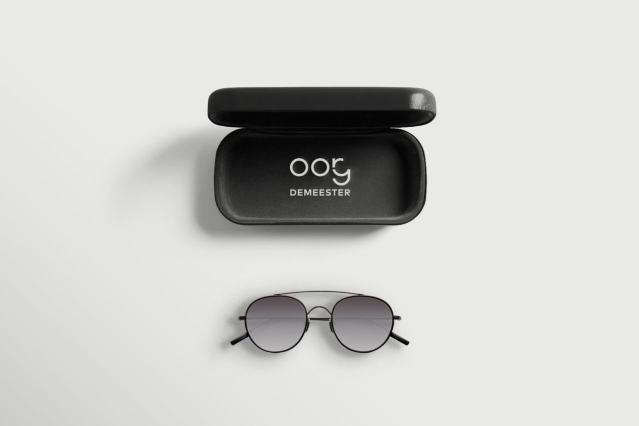
The optician’s two fields of expertise – seeing and hearing – playfully come together in one logo that is striking in its simplicity. The new corporate identity represents Optiek Demeester’s characteristics: timeless, high quality and a little quirky.