The Instituut voor de Nederlandse Taal (Dutch Language Institute), based in the Netherlands and Flanders, is the treasurer of the Dutch language. For over 50 years, they have been researching, collecting and describing our language and vocabulary. After a reorganisation and name change, the INT felt the need to reposition itself and distinguish itself within the landscape of linguistics. How did we do that? We said it with words!
LANGUAGE AS VISUAL LANGUAGE
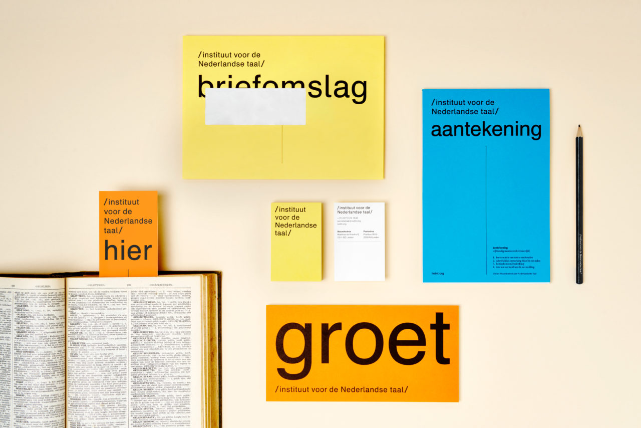
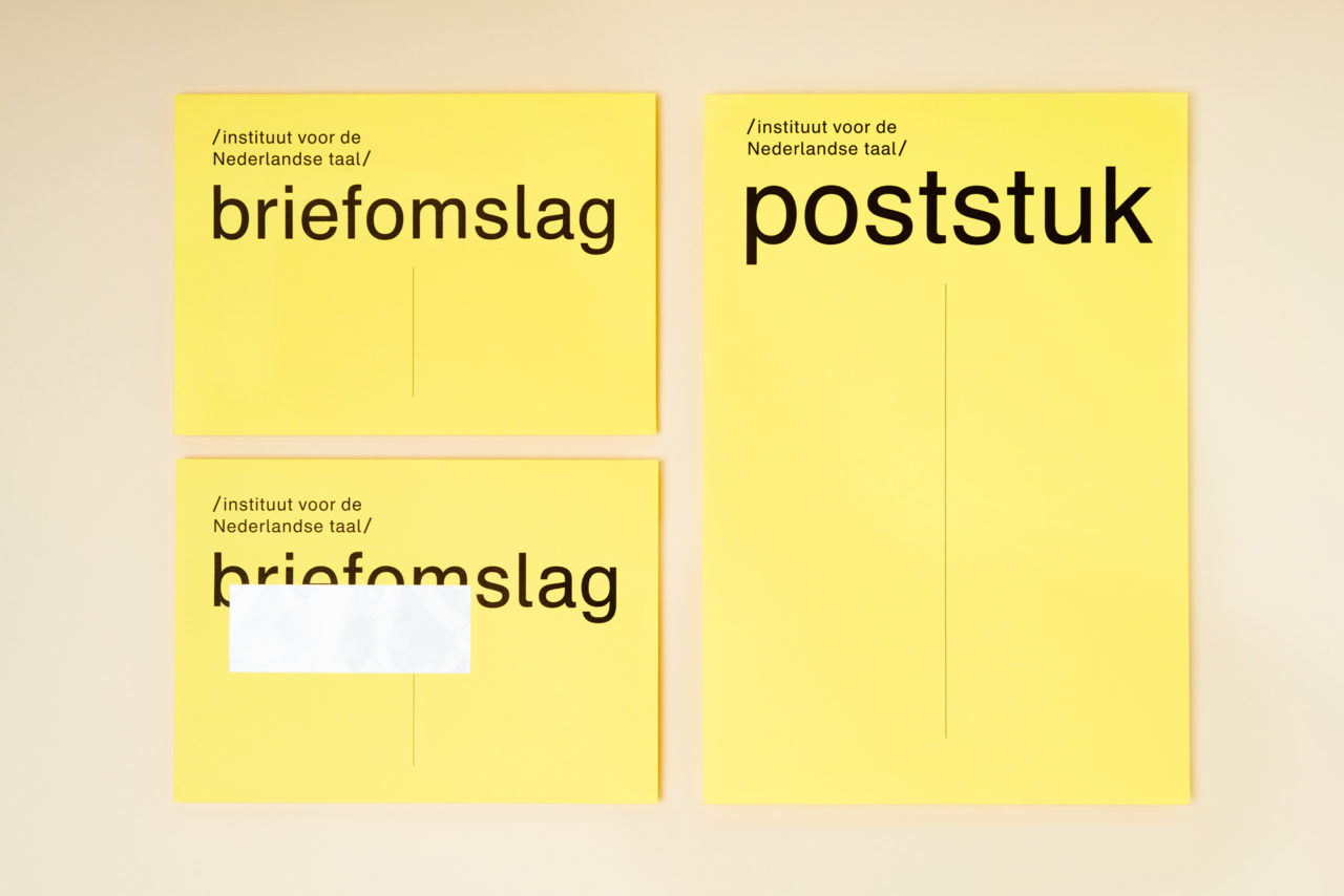
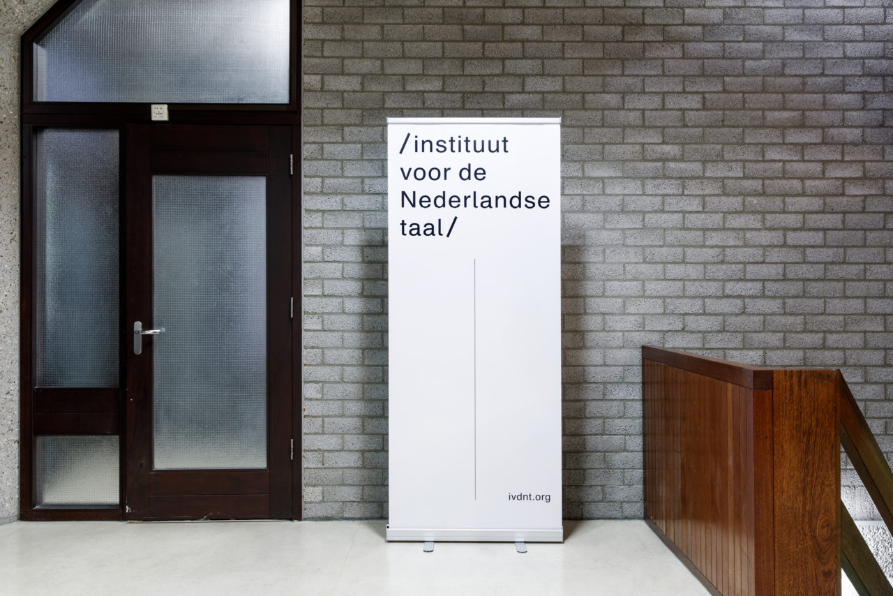
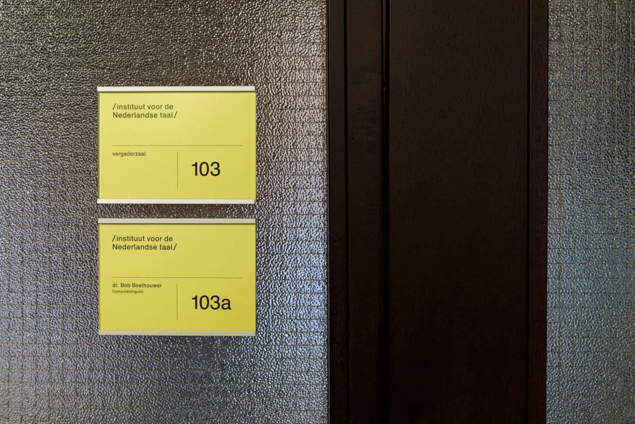
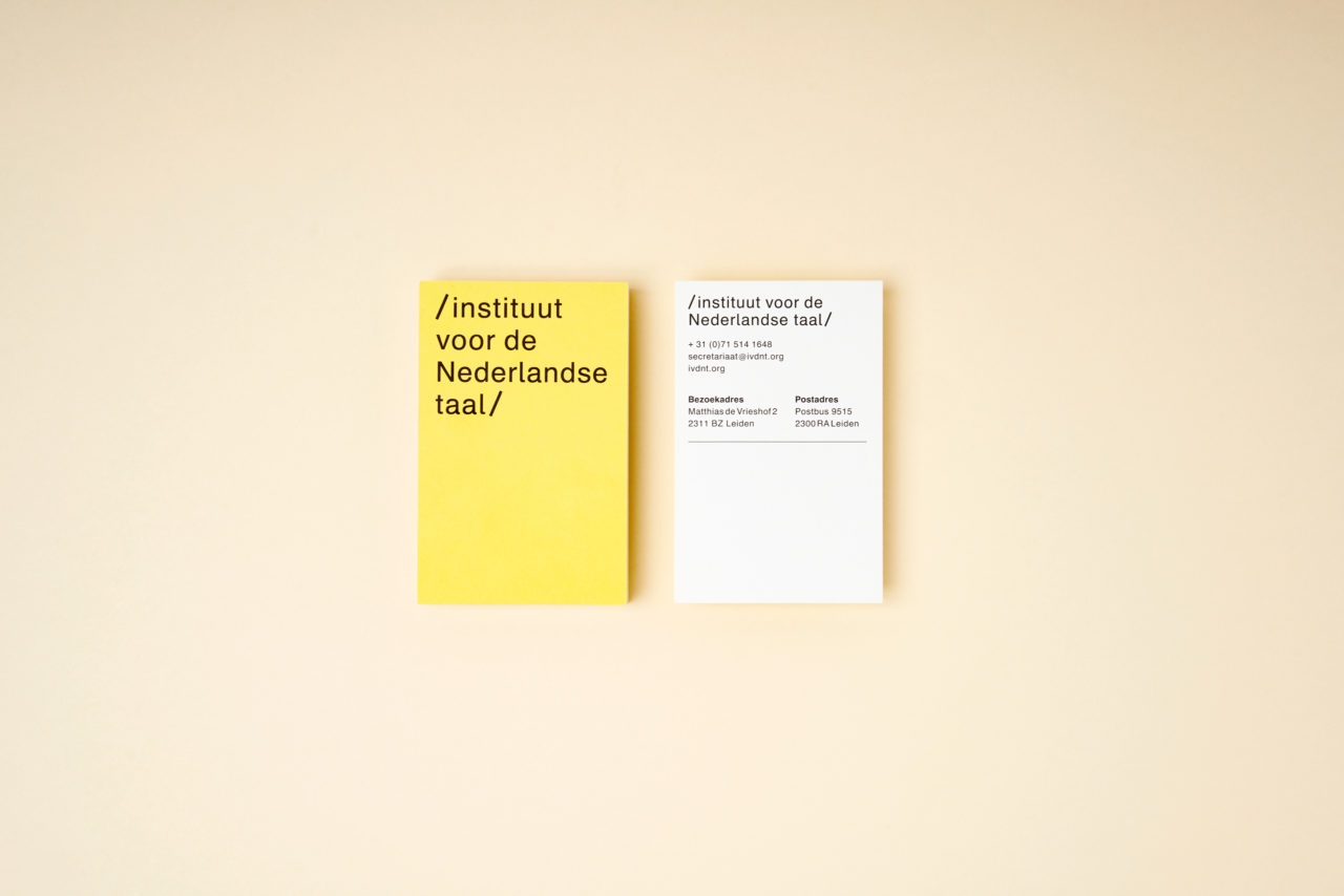
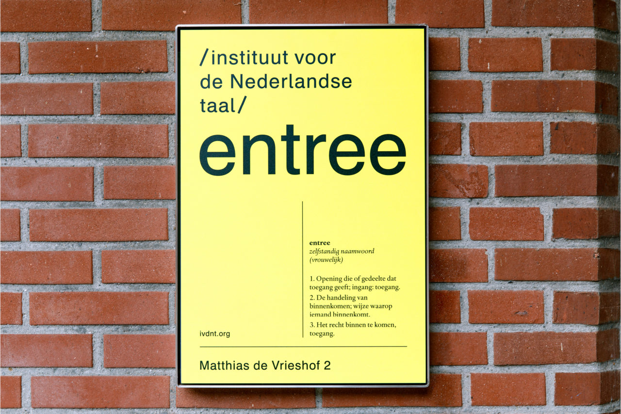
With a new name comes a new logo. We chose to write the name ‘Instituut voor de Nederlandse Taal’ in full to highlight what the institute stands for. The dynamic logo is responsive and adaptable to any medium, both in print and online.
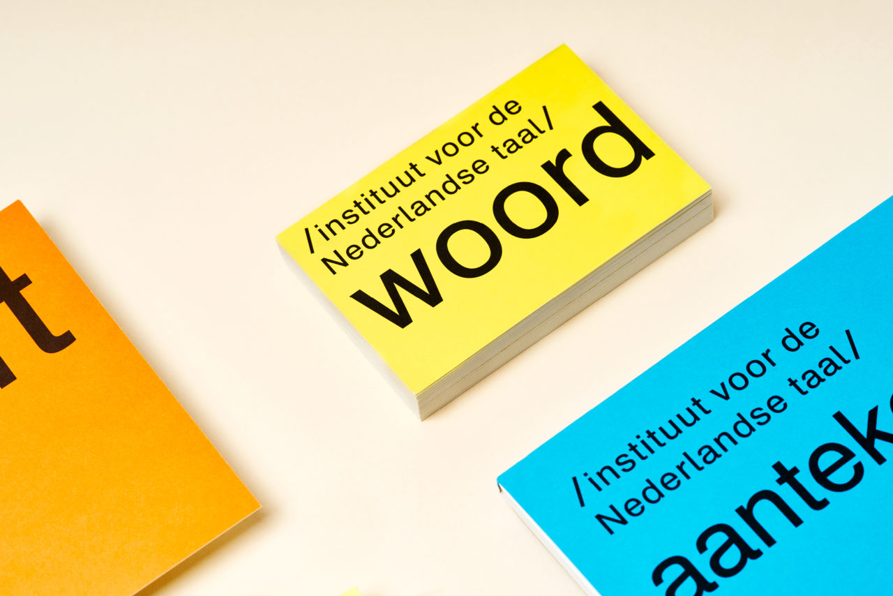
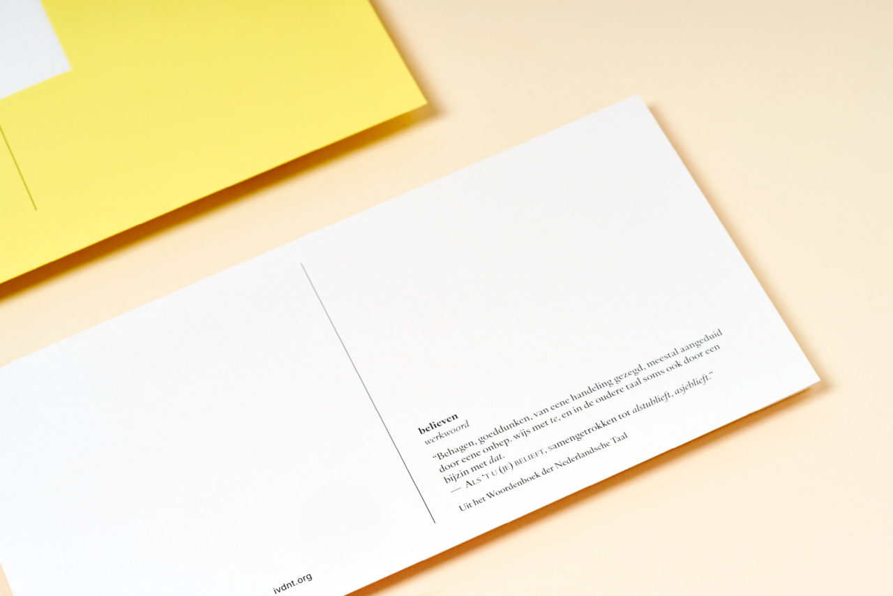
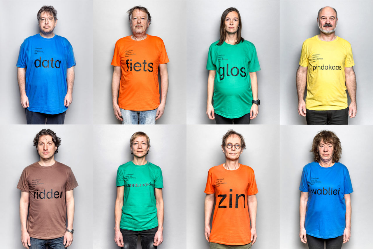
Each communicative expression from the INT is marked by the word that refers to its contents. This way, we turn language into something visual. As an ode to the Dutch vocabulary we make the words larger than life. For INT we transformed Language into a Visual language.
LANGUAGE AS A TOOL
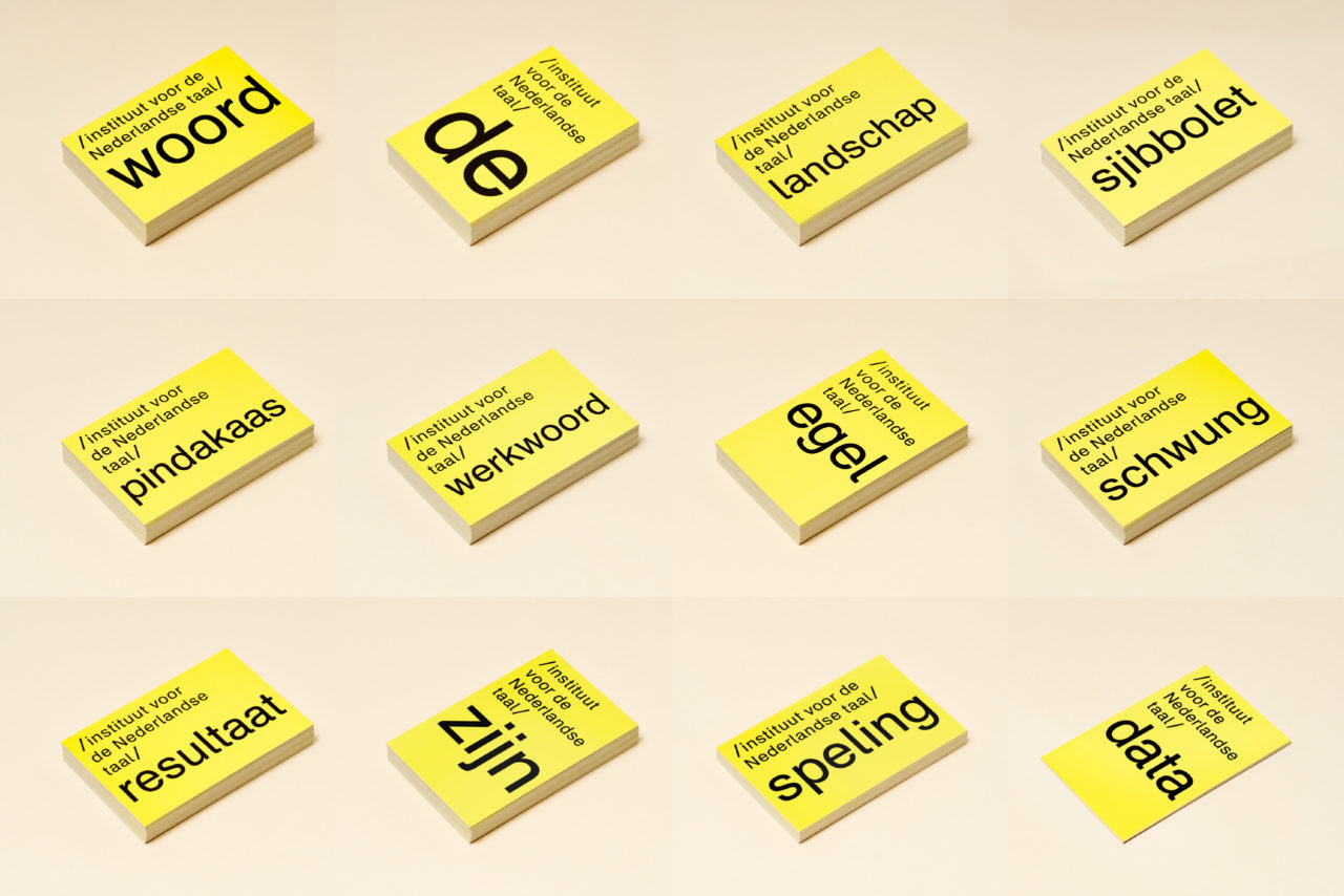
Why is peanut butter called peanut butter? Where does the word ‘Schwung’ come from? The INT likes to interact. Its employees are language connaisseurs who love sharing their expertise. Their favourite words, which you can find on their business cards, help to illustrate the richness of language and are a great way to get to know the institute. With this new identity, we have given the INT a tool with which they can communicate in a functional and graphical way.